Posts

The cover art for The Eagle & The Arrow is here!

The Eagle & The Arrow, book, A.J. O'Connell, Vagabondage, Battered Suitcase, Beware the Hawk

It’s here!

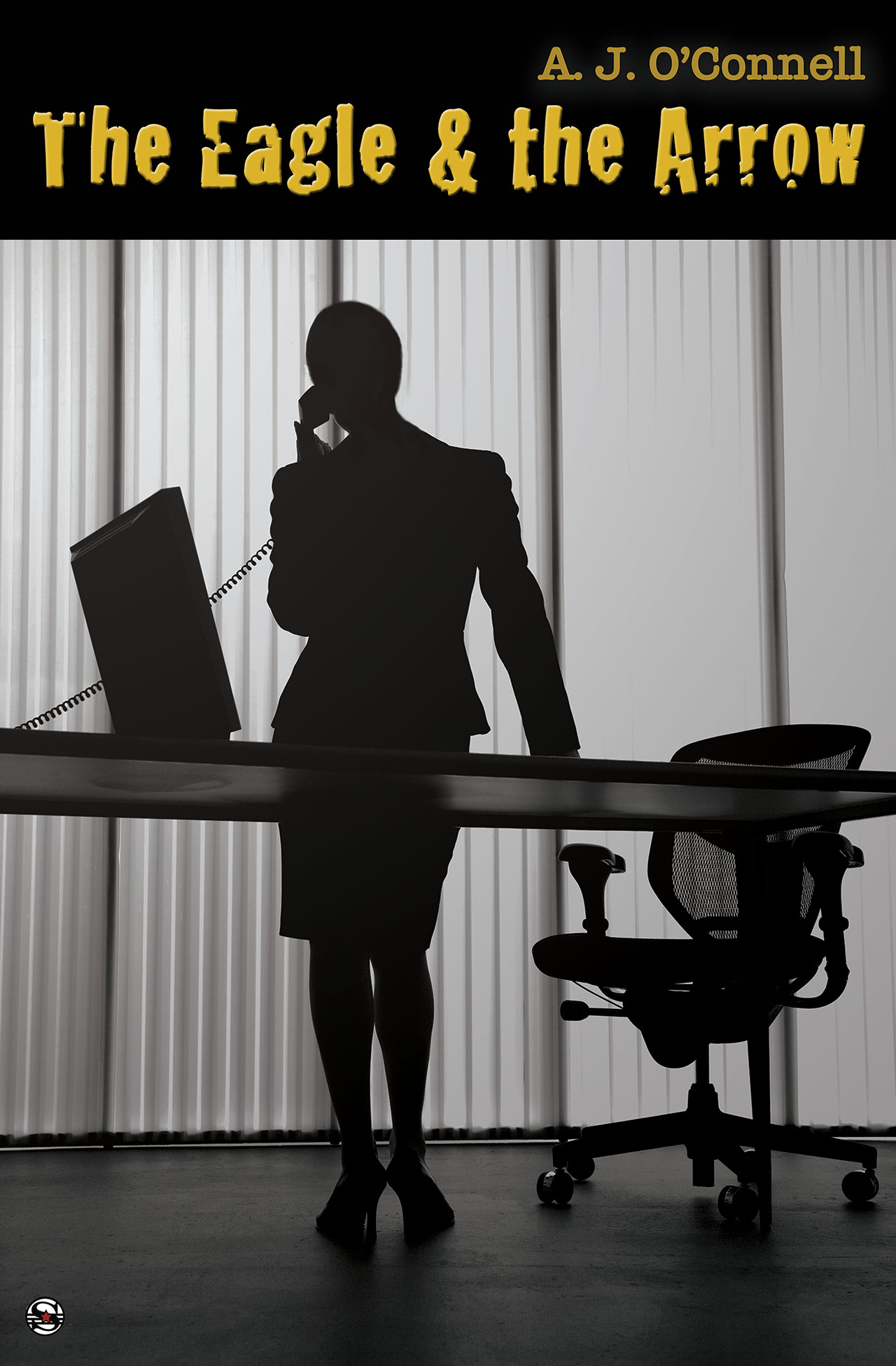
What I love about this cover is that although it’s visually similar to the cover of Beware the Hawk, I think it communicates the atmosphere of the second book beautifully. The Eagle & The Arrow continues the story started in Beware the Hawk, but features a new protagonist, a fresh set of dangers and a much different setting. As you can probably tell from the cover, these characters aren’t living in safehouses and fighting in bars. If the characters in the last book were pawns, these new characters are the chessmasters.

I’m very excited; this cover art represents a lot of work on the part of Vagabondage Press‘s art director, Maggie Ward,  and on the part of my editor, N. Apythia Morges.  I think Maggie put something like eight or nine possible covers, (including one we all loved, which couldn’t be used because the art we wanted was suddenly unavailable.)

I was very lucky to be allowed input into my cover. From what I understand, authors often don’t get a say; the cover is the responsibility of the the publishing house’s graphic arts department. I’m thrilled that I was allowed to make requests; I really, really loved the cover of Beware The Hawk, so much so, that I wanted the cover of the sequel to look consistent. Maggie obliged and here we are.

If you want a closer look at the cover, or to comment on it, visit my Facebook page. There is a photo album there for my book covers.

I do hope you like the cover as much as I do; you’ll be seeing a lot of it in the coming months as I start to ramp up promotion of the book, which comes out in June. I can’t wait, myself.

So the other day I posted about how I spent my Monday night up to my elbows in fake blood in our bathtub for the sake of my career.

I took several photos for the cover of my e-short story about a killer sea god. Now the fake blood stains are finally fading from my palms, but I have another problem: I don’t know which photo to choose for the cover.

So because you all rock and probably have exquisite taste, I want your help. I’ve put four of these photos up on Facebook.*  Head over there and tell me which one you like best.  I trust your input.

And while you’re there, please like me. When you have strange hobbies like I do, it’s good to know that you’re liked.

*It’s currently an untitled album because Facebook is freaking out and won’t let me edit the album, but bear with me.

denying the sea, ebook

Like House of Cards promo art, but with a mollusk.

So this evening was my husband’s night out with the boys, and as usual, when he left the house looked normal and I was full of project ideas.

When he came home, there was sand and fake blood all over the bathroom, the house was a disaster, and I was holed up in my office with a carton of fro-yo. For art.

It’s a testament to either my husband’s character or to my insanity that he didn’t bat an eye. In fact, he didn’t even ask why the bathroom looked like Quentin Tarantino had just filmed a scene there. He’s that used to this kind of thing.

But you might want to know, so I’ll tell you.
I recently got the bright idea to self-publish two already-published stories with Amazon’s Kindle Direct. The stories are not doing me any good just sitting around in my computer, so why not?

Apparently, however, you need to have a cover for such things. Since I probably won’t make enough money off these stories to cover the cost of a graphic artist, I thought I’d try to come up with a cover myself.

One of the stories is about a killer sea god. (Thus the fake blood and sea shells.) The other story is about a creepy lady who conveniently has an ice cream addiction. (Thus the half a carton of frozen yogurt I consumed.)

The result of my photo shoot? A bathroom that looks like a triple homicide was committed in it, a blown diet and a few okayish photos (but not of the fro-yo, because I ate most of that.) I think the photo in this post is probably the best. It doesn’t show how my fingers are now dyed the color of Mikhail Gorbachev’s birthmark.

I will keep you posted on the progress of the short stories, but at the moment, I’m not sure when they will  be coming out. This is mostly because of the cover art. Despite the fact that the bathtub might now be permanently pink, I still think I need better photos.

Might it be a good idea to hire an artist? It might. But only if that artist is willing to work for fro-yo.

I was going to write a nice, well-thought-out post about what I had finally decided to do about my New Years resolutions, but instead I’m just going to post these two things.

First, the publication of Beware The Hawk, is set for Tuesday, Jan. 17. Vagabondage Press will be releasing it as an e-book as you know.

Second, the cover art is here! I couldn’t help myself – I had to share. I am  disproportionately excited about this art. Knowing that someone else read the book and designed the cover based on what she read makes me feel like part of a team, and it also makes the fact that the book is being published that much more real. Maybe this is just a first-time author thing, though. Probably seasoned writers don’t lose their minds when they see the cover art for their latest release. I expect that Stephen King probably greets his new cover designs with a yawn and a shrug.

I’m not Stephen King, so I reacted to the unveiling of the cover art the way my dog reacts when she hears the word “walkie.”

Without further ado, here it is:

Read more